The logo
Download all logo filesColor variations
The logo is available in three color variations:
- Color: A red version.
- Monochrome: A purple version.
- Grayscale: A version using only black, white, and shades of gray.
Positive
For use over light backgrounds. The red version should be used 99% of the time, as criteria has not yet been defined for the other versions.
Reverse
For use over dark backgrounds.
In compliance with WCAG 2.0 Accessibility guidelines, the logo and its background should always have a contrast ratio of at least 3:1. You can check the contrast ratio using WebAIM’s Contrast Checker tool.
Vitae and IFC
Vitae is a Category 3 branded product of IFC. It is a donor-supported entity developed by MAS Advisory’s education team.
The Vitae logo should be used with the IFC “innovation of” logo by default, but can occasionally be displayed on its own, such as for conference sponsorship, as a social media icon, or in an IFC report.
Positive
For use over light backgrounds.
Reverse
For use over dark backgrounds.
Spacing
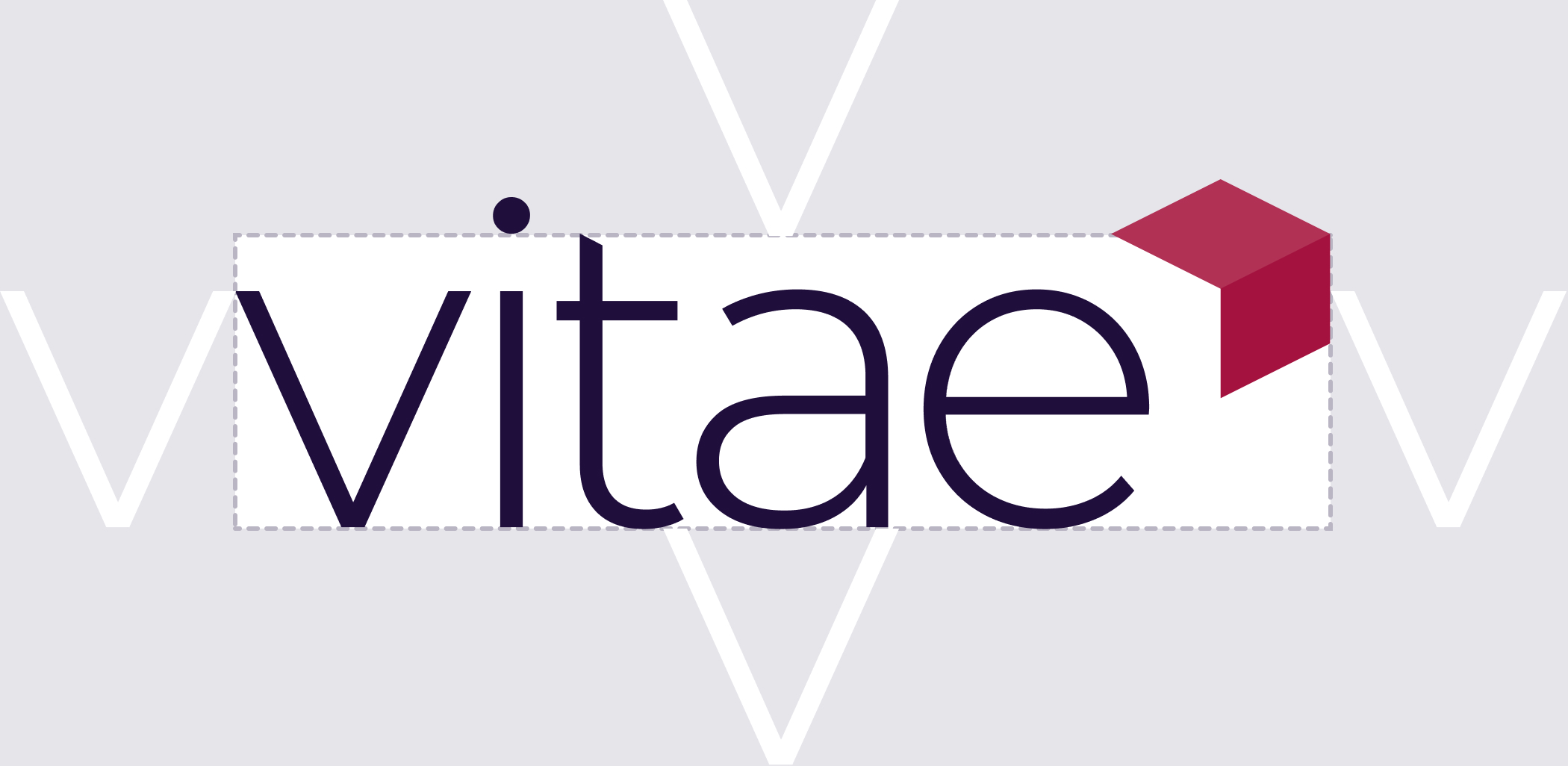
To ensure the logo has enough space around it, draw an imaginary box around the wordmark. The box should extend, horizontally, to the outside of the icon; vertically, it should extend only to the top of the “t”. Then add space around the box equivalent to at least one “v” character.
Usage guidance
When applying the logo to branded collateral, be sure to follow these guidelines to ensure that the logo is visually clear, legible, and consistent.
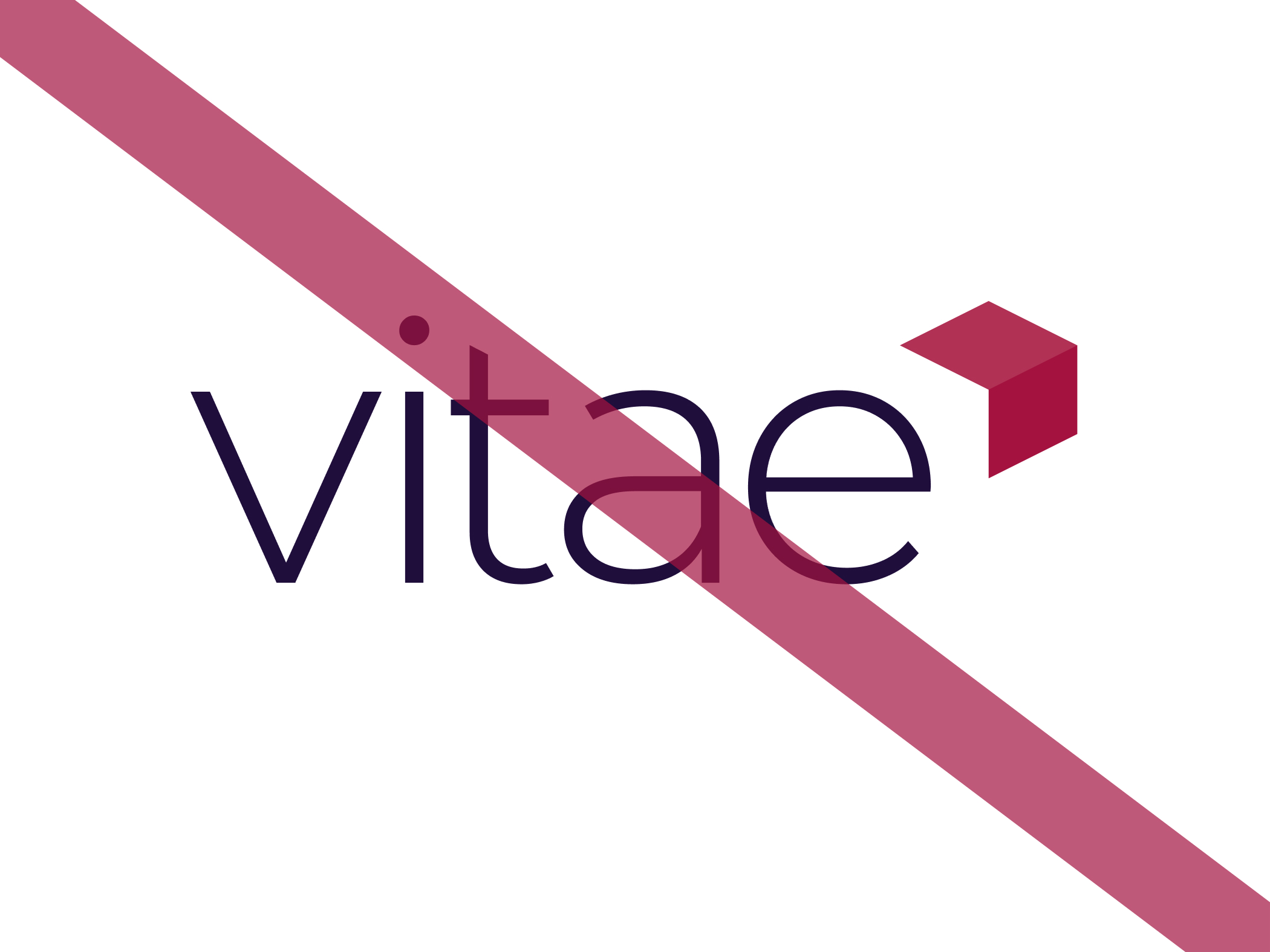
- Do not change the colors in the logo; use only the provided color variations.
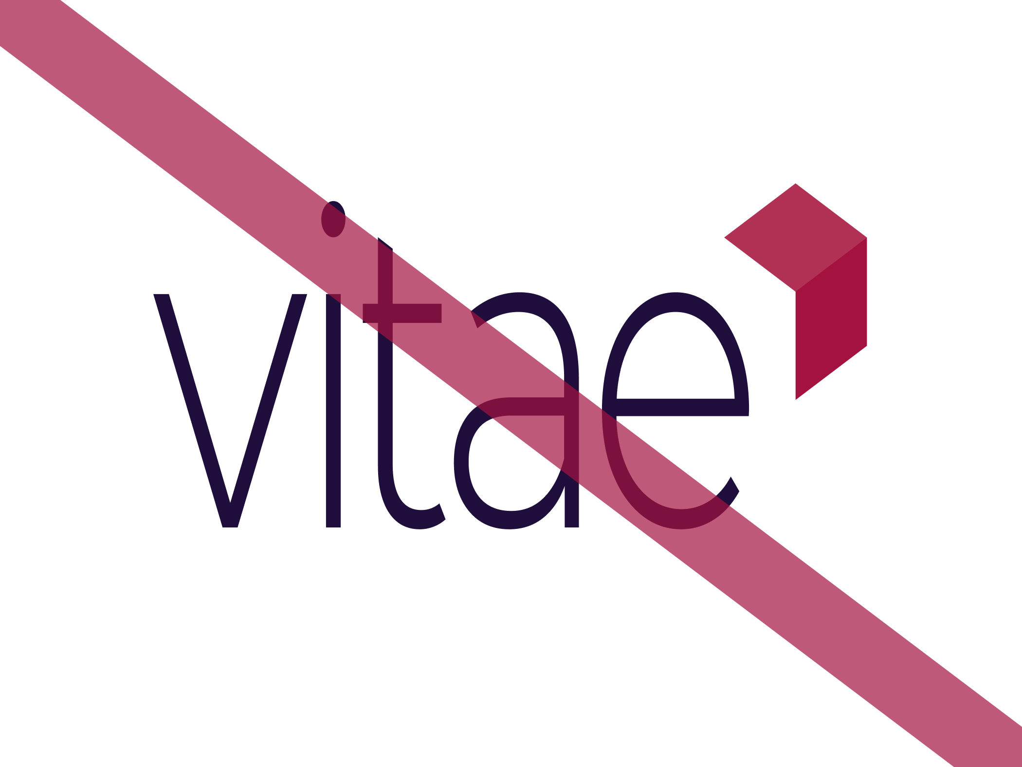
- Do not distort the logo; make sure to preserve its original aspect ratio when scaling up or down.
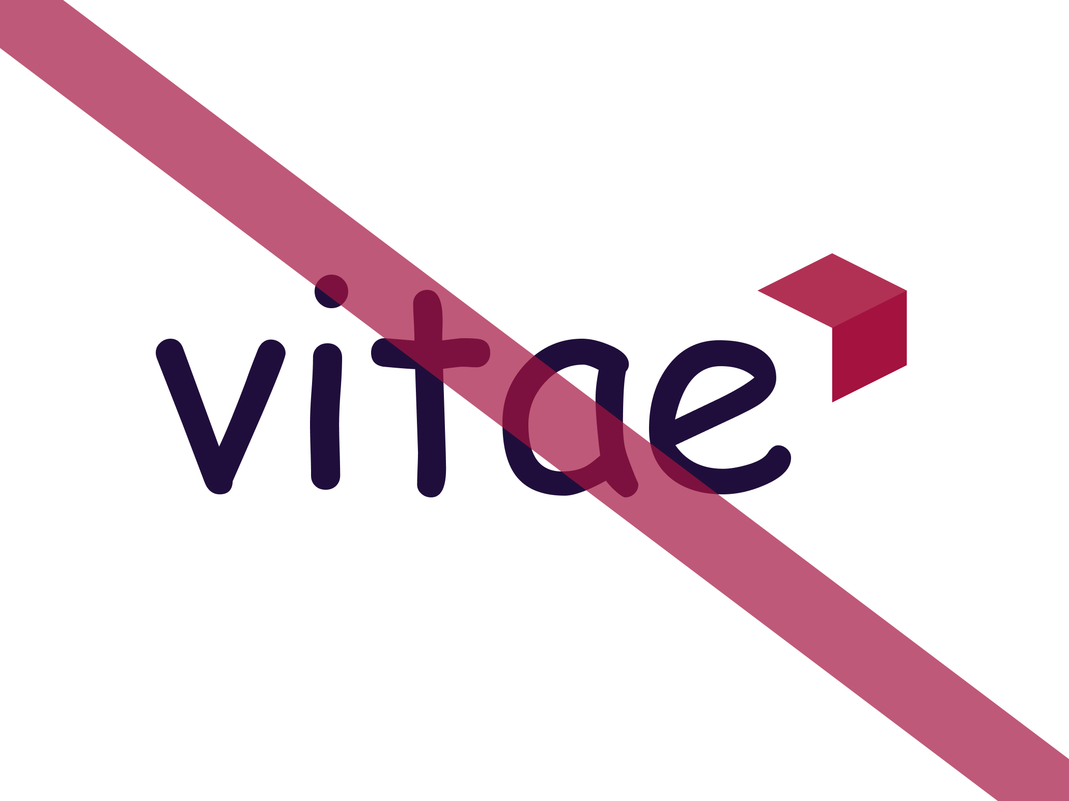
- Do not attempt to recreate the logo yourself or use another typeface. Use only the original logo files as-is.
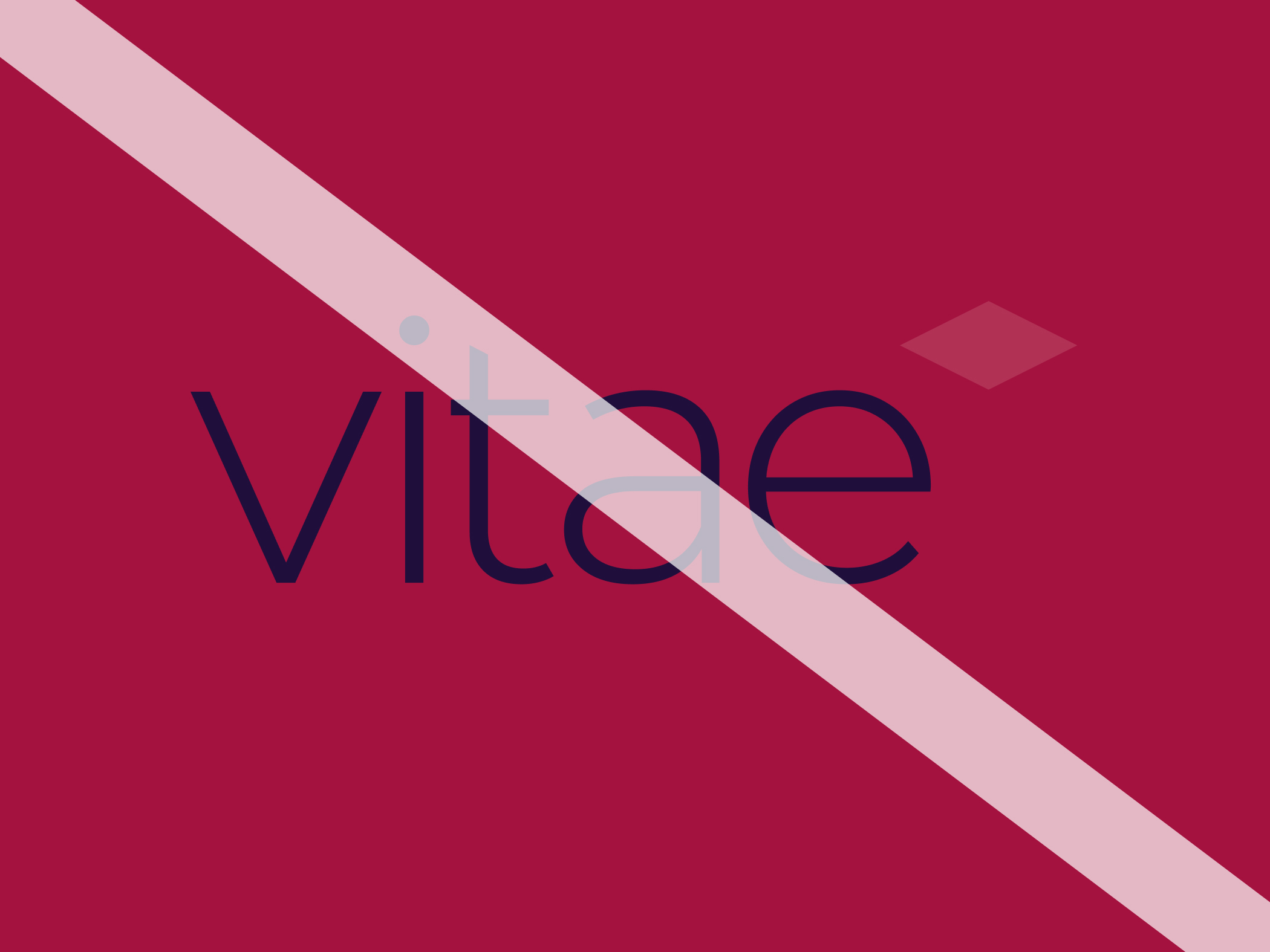
- Make sure the logo has enough contrast with its background. Use the positive version with a sufficiently light background; use the reverse version with a sufficiently dark background.
- Do not place the logo over imagery. Always place the logo over a solid background to ensure it has enough spacing and legibility.
Summary
- **Use the default red color logo in most cases.**Use the reverse version when there is not enough contrast between the positive version and the background.
- Use the grayscale and monochrome versions only when color is not available or when the color logo will not have enough contrast with its background (e.g. if the background color is red).
